

Walrus Magazine Redesign
Date
2009
Designer
Brian MorganClient
Walrus Magazine
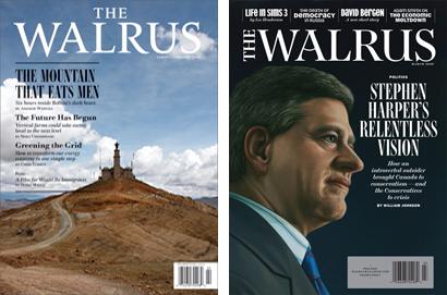
_“…_At first glance, it looks much like the last one, but on closer examination you’ll notice, among other things, changes in its appearance. None of them is dramatic; all are riffs on what was there before. But taken together, they make the magazine more visually appealing and, ultimately, more readable. They also attest — better than I can in words — to the understated brilliance of Brian Morgan, our new art director (well, sort of new; he was a senior designer at _The Walrus_ from 2004 to 2006 before moving to _Maclean’s_).
Brian loves type, collecting fonts the way some people collect books. (His personal library contains more than a thousand.) So it was no surprise that type was on his agenda when he returned to the magazine, starting with the logo. He commissioned French typographer Jean François Porchez to [redraw its letterforms](http://www.typofonderie.com/gazette/hot_news/?id=308), making them more elegant, and moving the word “The” to one side, allowing more space for cover lines. Next, he turned to the magazine’s text and display fonts. “Because _The Walrus_ is text heavy,” he says, “I wanted a text font that would be effortless to read — that would almost disappear. I wanted the typographic equivalent of a well-tailored grey suit, a text font that would allow the display fonts to function as sedate or flashy ties, as needed.” He chose a contemporary iteration of [Caslon](http://www.linotype.com/348/williamcaslon.html), a typeface designed by William Caslon in the eighteenth century. As for the display fonts — the “sedate or flashy ties” — there will be many, including [Bodoni FB](http://www.fontbureau.com/fonts/BodoniFB), a redrawing of a Victorian classic; and [Scotch Modern](http://fontfeed.com/archives/atypi08-nick-shinn/), updated from Richard Austin’s original by Canadian Nick Shinn.”
–[John Macfarlane, Editor, The Walrus](http://www.walrusmagazine.com/articles/2009.03-editors-note-new-look-walrus-magazine/)