
Uno Fest Banner
Date
2010
Designer
Evan PineClient
Intrepid TheatreCategory
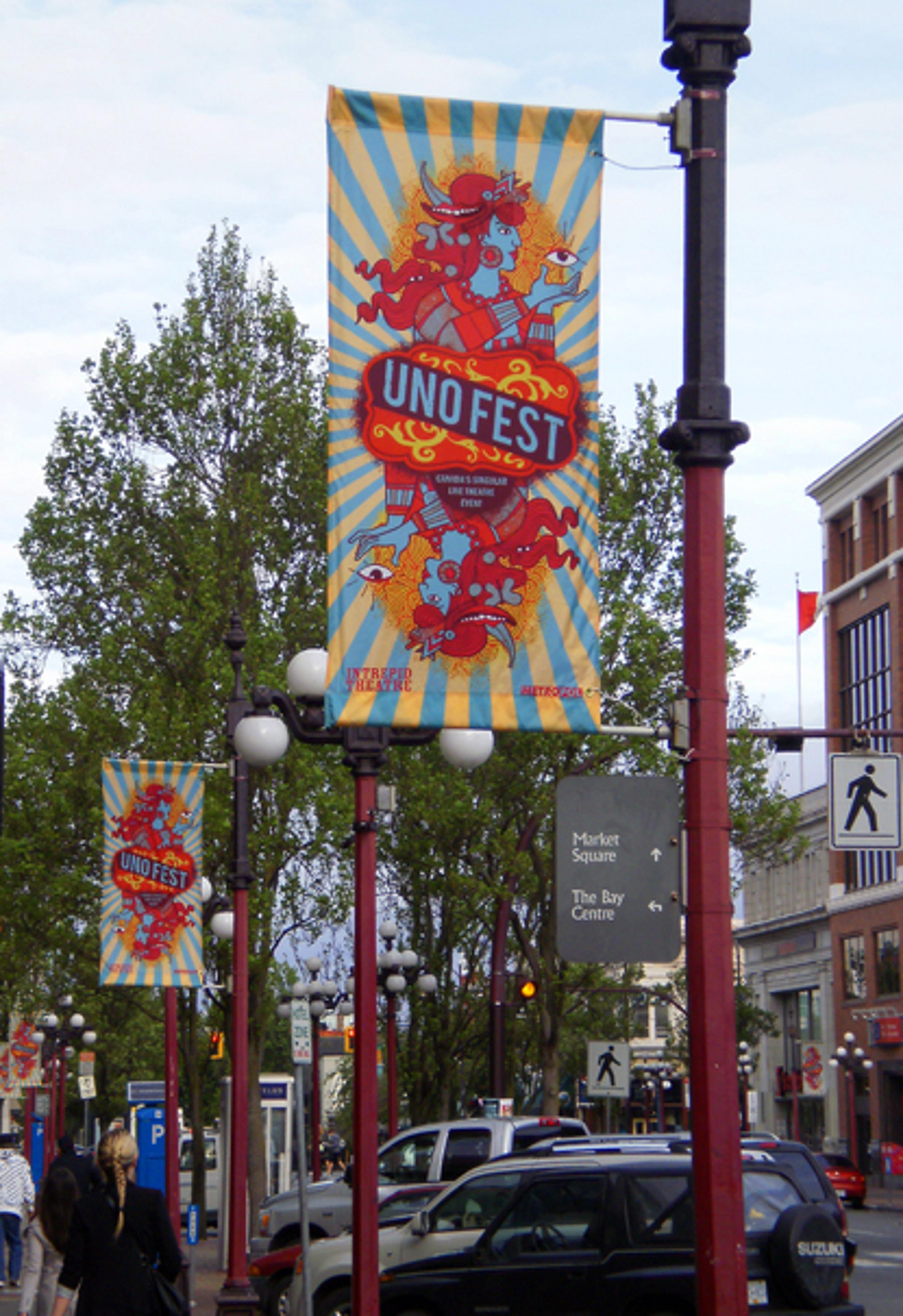
AdvertisingDoes it make sense for [“Canada’s Singular Live Theatre Event”](http://unofest.wordpress.com/about/) to have multiple graphic identities? Aside from the staring eyes and some of the more muted colours, Evan Pine’s banner doesn’t appear to have much in common with the [Uno Fest Poster, designed by Matt Salik](http://canadiandesignresource.ca/graphics/uno-fest-poster/). But, given the playful, anything-goes atmosphere established in Salik’s illustrations (and the festival itself), maybe visual consistency should take a back seat to tone. Though the illustration style and content are a departure, Pine maintains a similarly playful mood; where Salik achieved this feeling through a collision of seemingly disconnected characters, Pine utilizes a mash-up of stylistic references, combining old west playing cards with psychedelic rock style Eastern mysticism. The result is so striking, I’m sorry I even mentioned brand consistency.
Metadata
Client Location
Victoria, BC


