Stella Artois “Recyclage De Luxe” Campaign
Date
2009
Client
Stella Artois
Wow. We’ve [posted Cristiana Couceiro’s work before](http://canadiandesignresource.ca/?p=6132) — and even then we were certainly, well, familiar with her source material. The piece was a part of her personal portoflio, and we wrote it off as a collage/homage to one of Canada’s most recognizable logos. This time, however, it looks as if Couceiro has used the CBC logo for actual client work — for Belgian beer brand Stella Artois.
Now, one could argue that Couceiro is simply using a series of red and yellow concentric circle segments that just happen to look like the CBC logo — were it not for the fact that if you look at the [piece](http://canadiandesignresource.ca/?p=6132) we posted in March, you’ll see a definitive slice in the right side of the central circle, creating a ‘C’ (note that the slice is no longer visible in the Stella work). Definitely a dead ringer for [Burton Kramer’s iconic ‘exploding pizza’ CBC logo](http://canadiandesignresource.ca/?p=172).
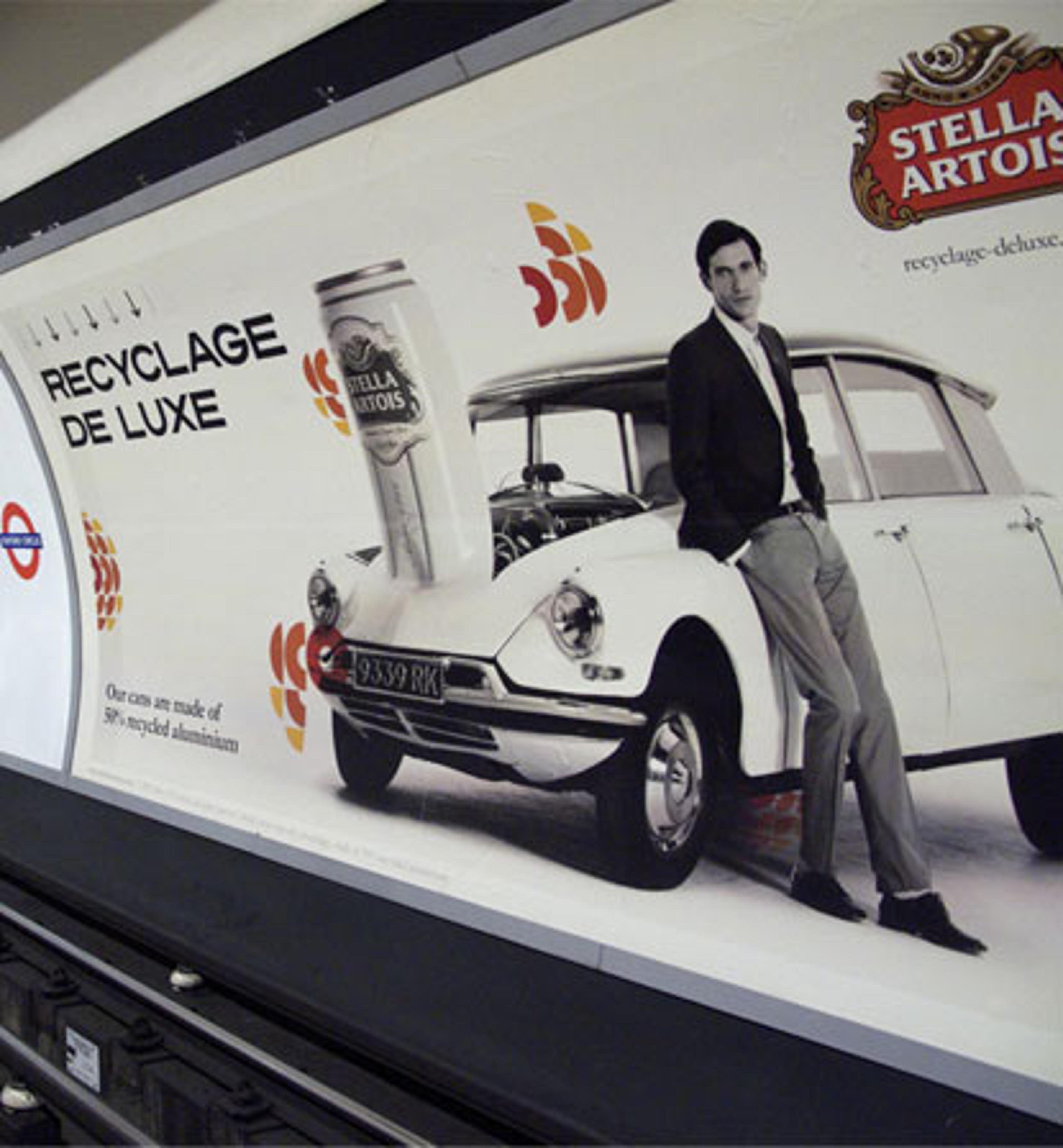
Ironically, the Campaign title is “Recyclage De Luxe”, and the message below it reads “Our cans are made of 50% recycled aluminum”. But I can’t seem to find “_and our campaign was created using 50% recycled logos_” anywhere.
_[UPDATED: This campaign was created by Mother London for Stella Artois and has been appearing throughout the London Underground.]_