GM News and GM Sans
Date
2007
Designer
Nick ShinnCategory
Typography
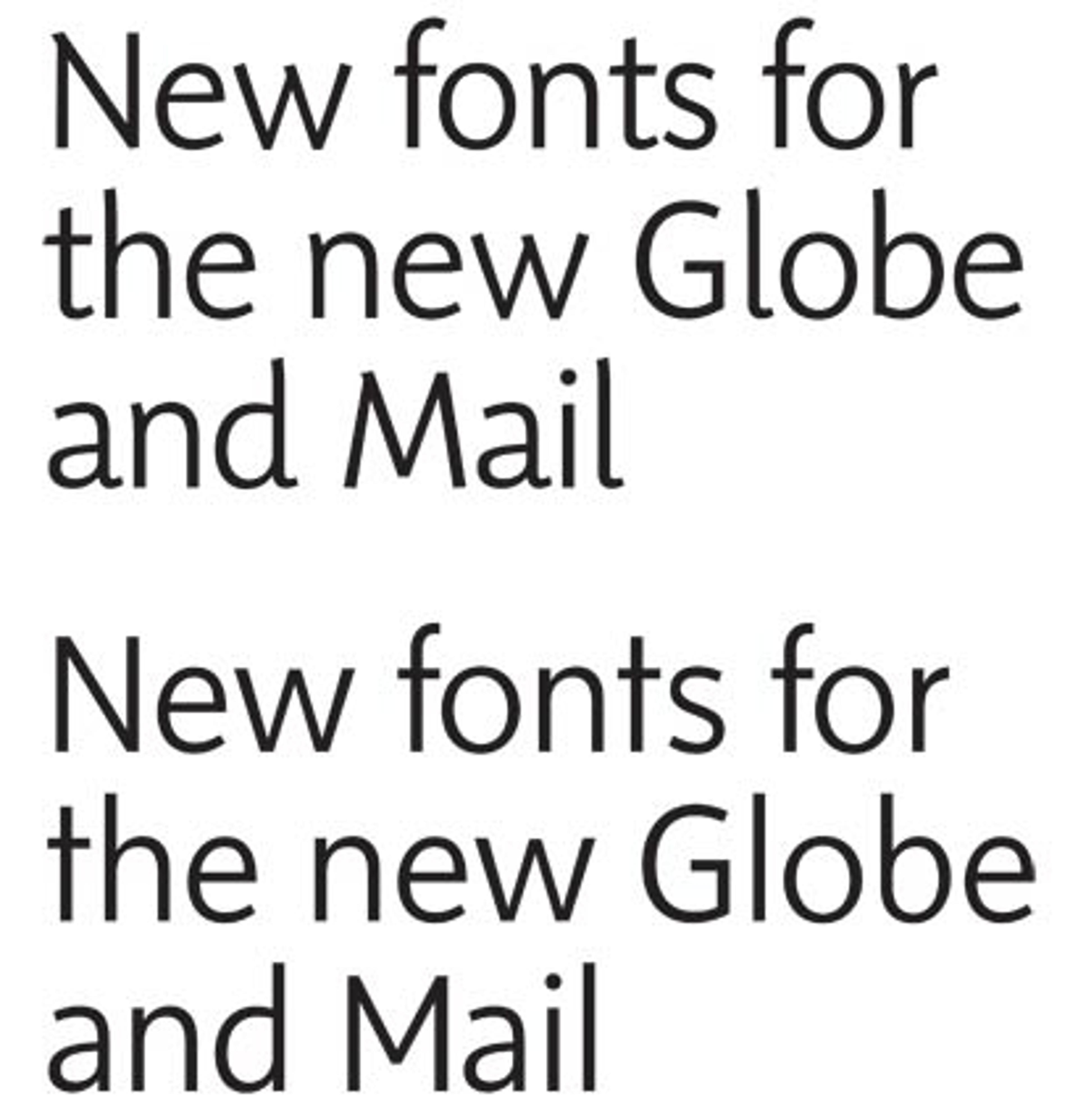
[GM News](http://www.shinntype.com/globenews.html) and [GM Sans](http://www.shinntype.com/globesans.html) are two typefaces designed by acclaimed type designer Nick Shinn for the recent Globe and Mail rebrand. With the Globe’s redesign bringing increased visual complexity to the layout of the paper (including more captions, breakouts, summaries and infographics), Shinn was tasked with creating a typeface that was expressive yet consistent, bold enough to catch the eye, and yet subtle enough to avoid distraction, and most importantly had a range broad enough to express the many levels of informational hierarchy that came with the new layout.
Typically, newspapers rely on contrasting serif and sans serifs to denote visual hierarchy, but Shinn took a different tack, designing two variants of the same sans typeface with enough in common to keep the layout clean, but with numerous subtle differences providing the reader with hierarchical cues (note the ‘b’, ‘M’ and ‘d’ in the sample above). In addition, both variants come in roman and italic with seven weights each – suffice it to say, the options are limitless.
GM News and GM Sans are currently only available for use in the Globe and Mail – but according to the designer, we can expect a commercial release in May of 2008.