48North Identity + Branding
Date
2020
Designer
Blok DesignClient
48North2018 saw Canada become the second country in the world to legalise adult-use of marijuana, bringing with it a wave of new brands desperate to cash in on this 21st century gold rush. While visible cannabis commerce is defined by dingy ‘head shops’ of yore and the current crop of hipster bro-oriented brands like Tokyo Smoke, there’s already been one stylish counterpoint to the deluge, a new name aiming for a gap in this budding market with a novel sort of visual vocabulary.
48North was set up this year with the aim of developing cannabis health and wellness products for women; such infusions are already a niche market, so to aim for a specific gender market adds another hurdle, no matter the large amount of female users in both Canada and beyond. The hurdle is intensified by the taboo associated with women smoking the plant, something which the company and [Toronto-based Blok Design](https://go.redirectingat.com/?id=803X1529174&xcust=29-3682364-11-0000000&sref=https%3A%2F%2Fwww.digitalartsonline.co.uk%2Ffeatures%2Fgraphic-design%2F48norths-slick-female-led-branding-for-cannabis-infusions-walks-fine-line-with-no-rule-book%2F&xs=1&url=http%3A%2F%2Fww.blokdesign.com%2F) aimed to tackle with 48North’s branding.
“To work on this project we needed to expand the way we thought and dive deeply into learning all the possibilities that lie ahead for women in cannabis,” explains Blok Design director Vanessa Eckstein. “We designed a brand for women, honouring women with the freedom to choose and expand wherever they might be in the spectrum.”
Blok Design went about this feminine-based approach through certain colour choices and product designs; the hemp-infused wellness oil that came with promotional packs for example wouldn’t look amiss on the shelves of Lush.
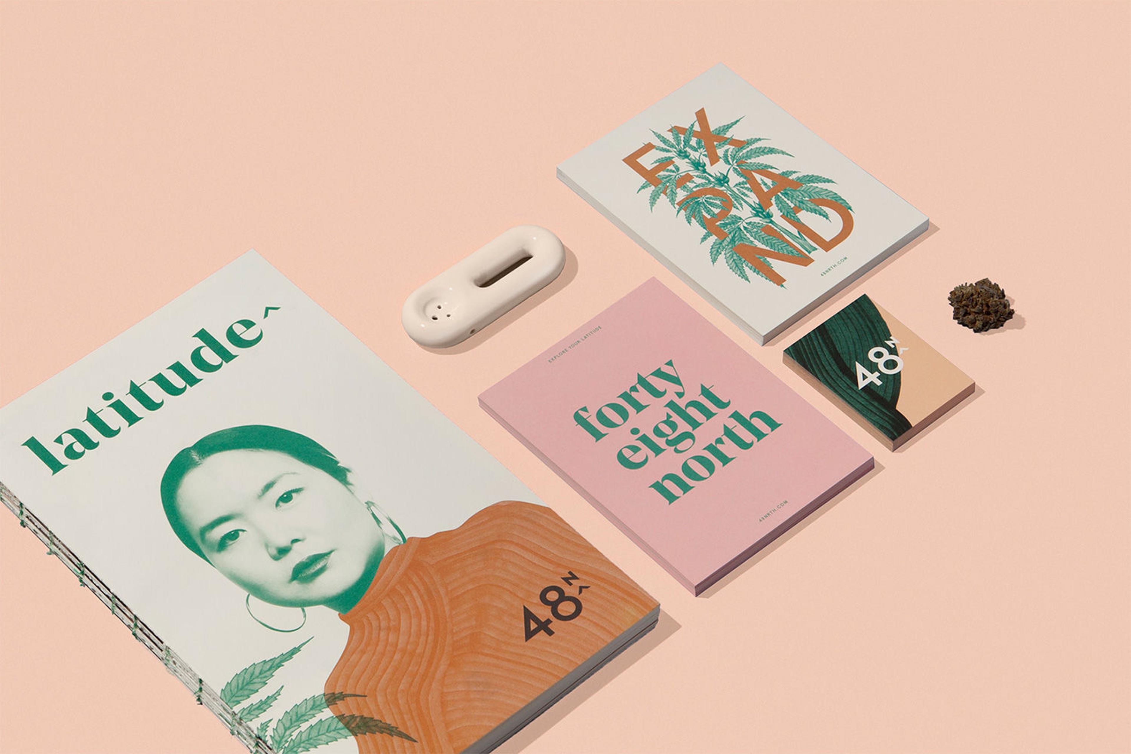
A more direct approach came in the form of _[Latitude,](https://go.redirectingat.com/?id=803X1529174&xcust=29-3682364-11-0000000&sref=https%3A%2F%2Fwww.digitalartsonline.co.uk%2Ffeatures%2Fgraphic-design%2F48norths-slick-female-led-branding-for-cannabis-infusions-walks-fine-line-with-no-rule-book%2F&xs=1&url=http%3A%2F%2Fwww.explorelatitude.com%2F)_[a one-shot magazine](https://go.redirectingat.com/?id=803X1529174&xcust=29-3682364-11-0000000&sref=https%3A%2F%2Fwww.digitalartsonline.co.uk%2Ffeatures%2Fgraphic-design%2F48norths-slick-female-led-branding-for-cannabis-infusions-walks-fine-line-with-no-rule-book%2F&xs=1&url=http%3A%2F%2Fwww.explorelatitude.com%2F) that profiles female users of all backgrounds from around Canada about their use of the plant in everyday life. As Vanessa tells us, Blok Design worked on _Latitude_ with the clear intent of creating a platform of communication where “women can share their stories, get clear and knowledgeable information, expand and challenge preconceptions and have a personal account of the many opportunities that exist with the plant itself, as well as their own choices.”
The magazine, with its stylish use of photography and type, comes in both online and print form; explaining 48North’s decision to not stick exclusively to digital, Vanessa explains it fit in with the rest of the branding’s sensual feel.
“The more we go digitally the more we are attracted by the sensuality and the materiality of objects,” she says. “Books and magazines not only take on physical space, they become objects with value. The magazine was also part of the launch campaign so there was a unique emotion we wanted to connect with.”
Intriguingly, though, such direct recognition of the consumer and their consumption came in hand with recognition of Canada’s shifting legislation in wake of the new ruling; while use of the crop is now legal, the rules for branding and public visibility are still not firmly set in stone nor exclusively liberal.
“Because we still have many changing rules, depicting the plant itself was not always possible,” Vanessa says about one particular problem resulting from this state of uncertainty. “This made us rethink how we insinuate, photograph movement, illustrate and paint an emotion. The design came from the many constraints we had and from there we found its very unique and sensorial language.”
With such restrictions and hurdles, it’s impressive how clear and concise Blok Design’s end result for 48North is, one that somehow both pioneers female representation in the cannabis consumer market, and yet reveals a more honest face to this field. Not only is female consumption at a high proportion, but so is the female power behind with the market, with almost 30% of those holding executive level positions in the cannabis industry last year being women.
Vanessa gives us a last word on the project as a whole.
“This brand is essentially about rethinking the relationship we have with cannabis and expanding the way we relate to it,” she concludes. “It is about health and wellness so it lives within a space that connects to the quality of a brand’s ethics and professionalism but also the emotional connection to all that we as women find important in our lives.”
“Colour, typography, illustration, words, content, meaning. Each aspect of this project was thought through – and then felt. It is less about deconstructing elements of the design but connecting to all the pieces and how they connect to you.”